As 2026 starts, it's a great time to look back at what actually worked in 2025.
Some campaigns were funny. Some were weird. Others were simple but smart. Each one shows a clear lesson you can use.
Dive into the article to see 10 marketing campaigns that grabbed attention and stayed in people's heads. You'll get quick stories, takeaways, and ideas you can copy for your next marketing gimmicks.
Key Takeaways
- Billie's scratch-and-sniff armpit posters and Rare Beauty's scented billboards proved sampling beats explaining when scent is the product.
- KitKat's phone swap posters and Heinz's fry-box lookalike idea showed that a single visual metaphor can replace paragraphs of copy.
- Duolingo's owl "death" storyline showed that ongoing episodes and audience tasks can turn attention into repeat app use.
- Canva's billboards and State Farm's Batman humour showed that laughing at real pain points makes even dull categories feel shareable.
- Gap's KATSEYE dance and Axe's claw-machine bus stop proved that built-in participation makes people promote your campaign for free.
- KFC's gravy cult-style film and outdoor placements showed that taking a clear creative stance beats playing safe in a crowded feed.
- Across all 10, the pattern is simple: get one idea, one action, and one clear next step, then repeat it everywhere.
Why These Campaigns Won in 2025
 Image: @pexels via canva.com
2025 was noisy. Budgets were tight in many places, and people were picky about what they gave attention to. The campaigns that won didn't try to please everyone, but they picked one clear idea and ran with it. They also made things easy to understand in seconds, which matters a lot on billboards and social feeds.
A big pattern shows up across these 10 examples: brands didn't just "say" something, they made people feel it. Some used nostalgia, some used humour, some used bold stunts, and many were built for social sharing first.
Here's what these brands did well:
- Simple idea, instant get: If someone understands it in two seconds, it's more likely to stick.
- Let people join in: Interactive OOH and "do this now" moments turn viewers into participants.
- Product demo, not product talk: Show what it does (smell it, try it, use it) instead of listing features.
- Cultural truth: The best ideas come from habits people already have, like scrolling or snacking.
- Big entertainment energy: Some brands went weird on purpose because being safe often means being ignored.
- Consistent brand voice: The best ones stuck to one tone across every channel.
Ready to steal the lessons (the ethical way)? Keep reading for the 10 greatest marketing campaigns of 2025, plus simple takeaways you can use for your next launch.
1. Billie's 'Scratch-and-Sniff Pits' Billboards
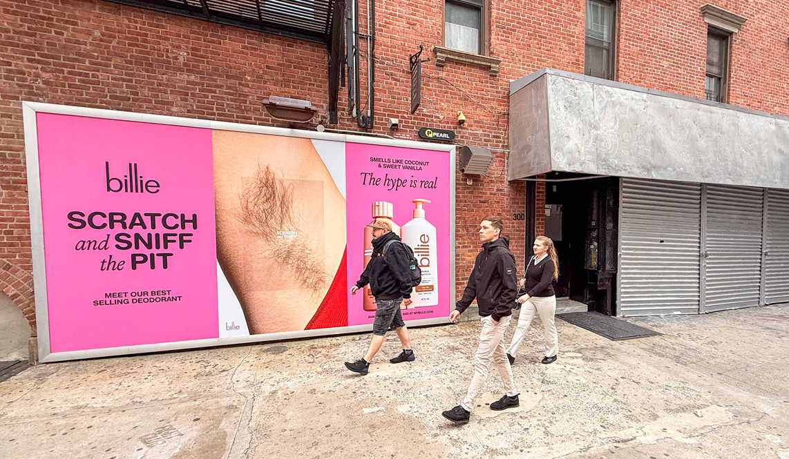 Image: pearlmedia.com
In April 2025, Billie put up scratch-and-sniff posters in busy parts of NYC, so people could literally smell the scent of its Coco Villa All Day Deodorant while walking down the street. The posters showed close-up armpits (with hair and without), plus clear instructions telling people where to scratch, which made the whole thing hard to ignore.
They focused on one simple behaviour: lots of people like to smell a product before buying it, especially deodorant. So instead of hoping shoppers would find a tester in-store, Billie brought that 'try it' moment out into the open where anyone could take part.
It was a bit gross, but that was the point. The campaign used a tiny bit of shock to grab attention, then quickly turned that attention into curiosity about the product smell. Billie also sent cards showing the poster images and locations to influencers and the press, which helped push the idea further than just the people who walked past the posters.
Why It Stood Out and The Takeaway
It was easy to understand in one second. Big text. Clear action. A fun, slightly daring moment people wanted to try (or at least film). It also matched the product perfectly: deodorant is all about scent, so making the ad 'smellable' wasn't a gimmick but a direct product demo.
It also went viral because it turned normal people into part of the ad. When someone stops, scratches, reacts, and shares it, they're doing the marketing for you.
For marketers and brands, you should:
- Be brave with taboos: Don't be scared to poke fun at awkward topics if it fits your brand's personality.
- Prove it physically: Find creative ways to let customers test your main promise before they spend any money.
- Make it interactive: Give people something active to do with your ad besides just reading it.
- Create a shareable moment: Build your campaign so that people naturally want to film it and show it to their friends.
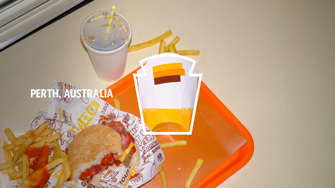
2. Heinz's 'Looks Familiar' Global Campaign
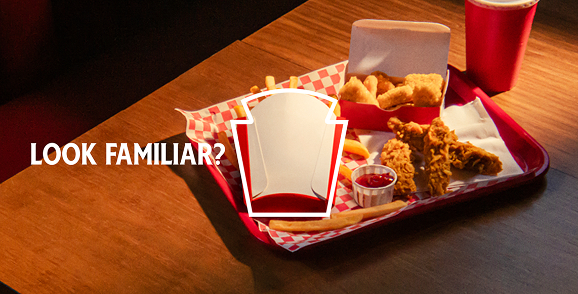 Image: adweek.com
Heinz built this 2025 campaign around a simple spot-the-shape idea. They pointed out that a lot of takeaway fry boxes have the same outline as the Heinz keystone label.
The ads showed everyday fast-food meals (like fries with a burger or nuggets) sitting in plain packaging, then used the line 'Looks Familiar' to help you notice the shape match. Once you see it, you can't unsee it. It will always make you think of Heinz the moment you see fries.
The campaign ran across multiple markets and used a mix of channels. It leaned heavily on out-of-home posters, then backed that up with video, social posts, influencer content, and PR.
 A screenshot from Heinz's video "Look Familiar. Watch the full video here.
Why It Stood Out and The Takeaway
The smart part here is how little branding it needed. The ads didn't have to shout 'Heinz' in massive letters to work. The shape did the work. Heinz used something people already see all the time (a fry box) and turned it into a reminder for their brand.
Most people don't stare at fry boxes. They just eat, and Heinz flipped that. They used a pattern hiding in plain sight and turned it into a global creative idea. It doesn't feel like a made-up marketing claim, but it feels like a fun discovery you can share with someone else.
The hidden message might also be 'Fries and Heinz belong together.' That's easy to get, easy to remember, and easy to repeat.
For marketers and brands, you should:
- Start with a real-world insight: Look for a truth customers already see, then build the story around that.
- Keep the idea visual: If people can understand it in one second, it works better on posters and social feeds.
- Let the brand show, not shout: Use distinctive shapes, colours, or cues so the brand feels obvious without being loud.
- Connect to the buying moment: Add a simple offer or next step (like a delivery app partnership) so interest can turn into action.
3. KitKat's 'Phone Break' OOH Ads
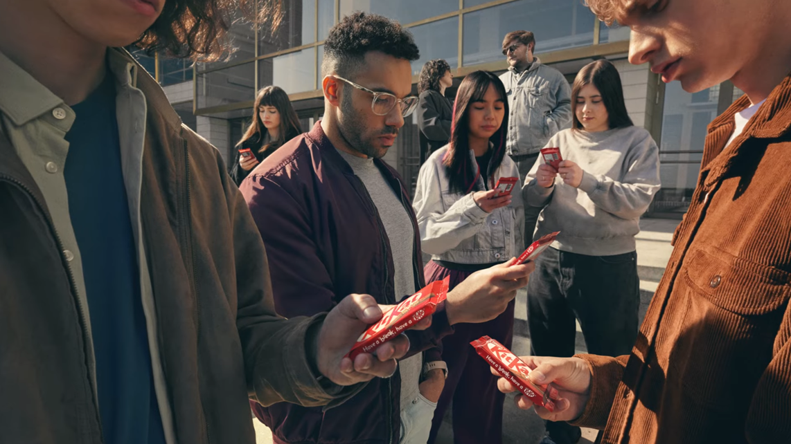 A screenshot from a video compiling the OOH ads of KitKat. Watch the full video here.
KitKat used a very simple swap in this 2025 out-of-home campaign from VML Czechia. They took photos of normal everyday situations (waiting at a bus stop, sitting in a cafe, standing in a queue) but replaced the smartphones in people's hands with KitKat bars.
That's it. No big headlines. No tagline printed on the poster. Just the visual of someone staring at a chocolate bar like it's their phone. The joke works instantly because a KitKat bar is roughly the same shape and size as a phone. You can't help but laugh at how silly we all look when we're glued to our screens.
The campaign ran across billboards, subway stations, and print media starting in April 2025. It didn't use any digital media spend, yet it generated millions of impressions through earned coverage.
Why It Stood Out and The Takeaway
KitKat didn't need to explain what 'Have a Break' means in 2025 because the image did it for them. The campaign worked across cultures because phone addiction is a global problem. You don't need to speak the local language to understand the joke. That made it perfect for out-of-home, where you only have two seconds to grab attention.
The jury at Cannes Lions called it a 'masterclass in outdoor' because it communicated a strong message with no words or logos, just one beautifully crafted image. That kind of restraint is rare in advertising, and it's why people remembered it.
The campaign went on to win the Outdoor Grand Prix at Cannes Lions 2025, making it the Czech Republic's first-ever Grand Prix win at the festival.
For marketers and brands, you should:
- Use visual substitution to make your point: Try to swap one familiar object for another to create instant recognition and humour.
- Tap into shared guilt or behaviour: Address something your audience already feels (like screen addiction) so the insight lands immediately.
- Design for shareability: Make your ad simple enough that someone can explain it in one sentence to a friend.
- Trust the power of restraint: Sometimes the strongest message is the one that doesn't shout, it just shows.
4. Rare Beauty's Scratch-and-Sniff Billboards
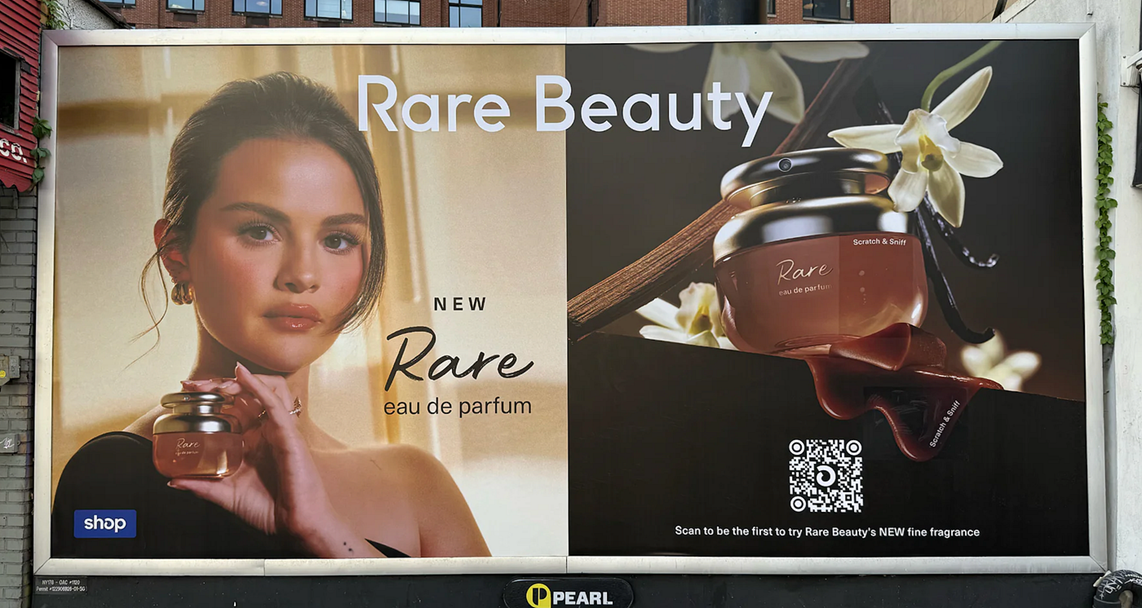 Image: medium.com
Rare Beauty went old-school and high-tech at the same time. In late July 2025, the brand put up three scratch-and-sniff billboards in NYC to promote its new fragrance, Rare Eau de Parfum.
People could walk up, scratch the billboard, and smell the perfume right there on the street. That matters because fragrance is hard to sell through a screen. You can't 'describe' a scent well enough to replace a real sniff. So Rare Beauty made the sniffing the ad itself.
Then they added a simple next step. Each billboard had a QR code that people could scan to request a mini rollerball sample through Shopify's Shop app. But it wasn't open to everyone online. Rare Beauty used geogated tech, which meant you had to be within the billboard's zone to claim the sample.
The locations were chosen for foot traffic and walkability, with the billboards placed in Soho and Chelsea. The campaign also leaned into the 'street discovery' vibe on social media, with Rare Beauty posting where to find the billboards and how to get the sample.
Why It Stood Out and The Takeaway
You can't smell perfume on a normal billboard. Rare Beauty made the billboard do the one thing shoppers actually want before buying fragrance: test it. The idea was also super easy to understand, even if you only looked for two seconds. Scratch. Smell. Scan. Done.
The scratch-and-sniff part made it playful, but the QR code made it practical, because people could take the experience home with a delivered sample. The geogating also made it feel exclusive, like a perk for people who found it in person.
For marketers and brands, you should:
- Make the product easy to try: If sampling drives sales, build sampling into the campaign itself.
- Turn offline into action: Add a QR code that leads to a clear next step, not just a homepage.
- Use location to create urgency: Geogating can make an offer feel real and limited.
- Pick spots people can stop at: Walkable locations make interactive OOH more likely to be used.
- Let the audience spread it: If the idea looks fun on camera, people will share it without being asked.
5. Duolingo's 'Duo Is Dead' Saga
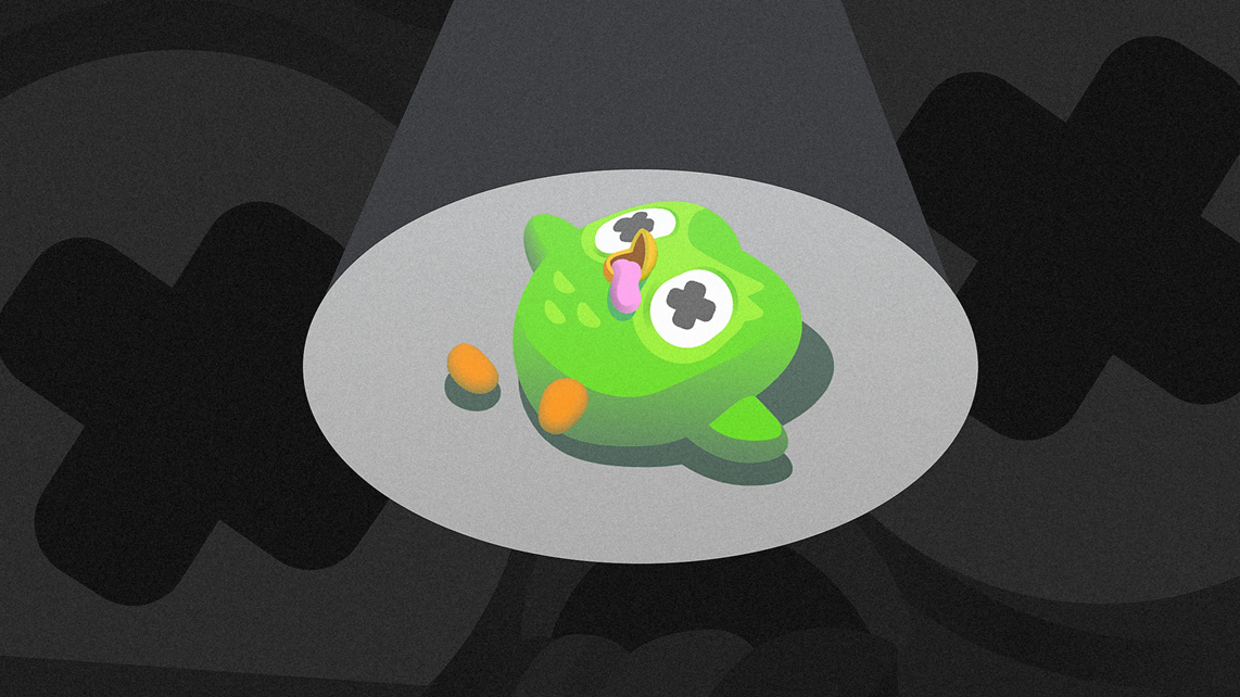 Image: fastcompany.com
In February 2025, Duolingo told the internet its green owl mascot, Duo, was dead. The brand didn't treat it like a one-post joke, either. It turned it into a full storyline across social media, with updates that kept people checking back to see what would happen next. Over a two-week window, Meltwater tracked around 169,000 mentions of Duo, with a big spike on the day Duolingo announced the 'death'.
Then Duolingo pushed the story further. They built a 'Bring Back Duo' landing page and made the audience part of the plot, asking users to earn a massive shared goal of XP through language practice to help 'resurrect' him. They also prepared an FAQ to keep the story clear and playful, including for kids who were confused or upset.
Duolingo's socials earned billions of impressions in the two weeks between the 'death' and the reveal that Duo faked it, and the brand said it drove a meaningful lift in new and returning users.
Why It Stood Out and The Takeaway
The campaign didn't stay trapped inside the joke. It kept pointing back to the product. The whole message was still: do your lessons. Keep your streak. Engage with the app.
Most brands try one funny tweet and hope it pops off. Duolingo committed to the plot, built suspense, and let the audience play along. The surprise factor was a big reason the launch hit so hard, because people weren't expecting a mascot's death.
 SourceA screenshot from the video of Duolingo, stating Duo faked his death. Watch the full video here.
Duolingo's social strategy works when the mascot is treated like a character people want to follow, not just a logo that sells language lessons. That's why people acted like they were reacting to a TV show. Brands even jumped into the comments, too, which kept the momentum going.
For marketers and brands, you should:
- Build a story people can follow: A simple storyline keeps attention longer than one-off jokes.
- Make the audience do something: Turn views into action with a clear task tied to your product.
- Plan for risk early: Write FAQs and prep support teams in case the public takes it differently than you expect.
- Be weird with a purpose: Don't chase 'buzz' unless it points back to usage, sign-ups, or sales.
- Use a consistent character voice: If your brand has a mascot or spokesperson, treat them like a real character people recognise.
6. Canva's Clever Billboards
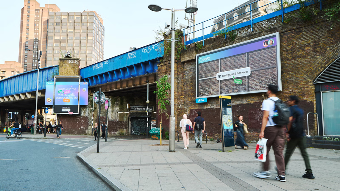 Image: stinkstudios.com
Canva and Stink Studios took over the area around London's Waterloo Station in June 2025 with a series of billboards that poked fun at the daily struggles designers and marketers face. The billboards showed things like a logo scaled way too big, a design in the wrong aspect ratio, and a poster covered in sticky notes full of conflicting feedback.
Each struggle referenced a Canva feature that solves the exact mess shown, like Magic Resize, Brand Kit, or the Background Remover tool. The whole thing was designed to feel like you were looking at someone's screen mid-disaster.
Everyone who works in marketing or creative has had a client say 'make the logo bigger', or has forgotten to check the export format. So the ads felt personal, like Canva was saying, 'We see you. And we built this for you.' The choice of Waterloo Station helped the campaign reach high volumes of commuters and professionals.
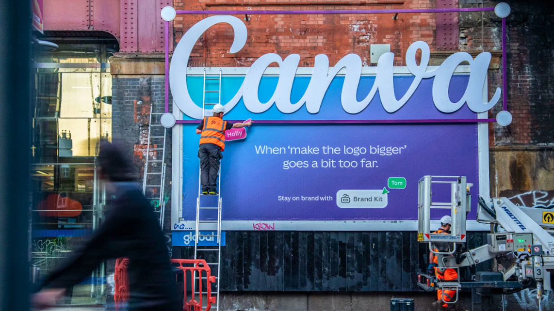 Image: marketing-interactive.com
Why It Stood Out and The Takeaway
It turned product demos into jokes people wanted to share. Most software ads just list features. Canva made those features funny by showing what happens when you don't have them. That flipped the normal 'before and after' format into something more playful and less salesy.
It also resonated because designers and marketers saw themselves in the ads. The campaign didn't hide from messy workflows or impossible client requests. It made fun of them, then offered a fix. The brand isn't pretending everything is perfect, but admitting design can be chaotic and saying Canva can help.
For marketers and brands, you should:
- Show the pain before the fix: People always connect with problems faster than they connect with features.
- Use humour that the audience understands: Inside jokes work when your audience lives that joke or struggles with it every day.
- Make the format do the work: If you're on a billboard, use the physical space to show something screens can't.
- Target high-traffic professional zones: If your audience commutes to work, put the ad where they travel.
7. State Farm's 'Batman vs. Bateman' Commercial
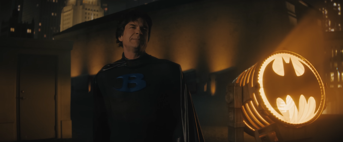 SourceA screenshot from State Farm's video. Watch the full commercial here.
State Farm launched this campaign in March 2025, timed for the college basketball tournament called March Madness. The star is Jason Bateman dressed as 'Bate-man', a fake superhero who fails at fighting bad guys like The Riddler, Poison Ivy, and Two-Face.
The ad compares him to the real Batman to make the point: having normal insurance is like having Bateman. You need State Farm, like you need Batman. The video shows Bateman on a scooter, getting tangled in vines, and letting Catwoman (played by SZA) escape with jewels.
The full extended cut is two minutes long, with 30-second and 15-second versions too. It stars streamer Kai Cenat filming the Joker, content creator Jordan Howlett (Jordan the Stallion) as Commissioner Gordon, and Jake. Originally planned for the Super Bowl, it was moved due to the LA wildfires. The ad ran on TV, streaming, audio, and social.
Why It Stood Out and The Takeaway
Bateman vs. Batman is a simple, clear joke anyone can get. The ad used a popular character (Batman) to make insurance feel exciting. That helped it break through during a busy sports event where lots of ads compete for attention.
It was enjoyed by everyone because it showed the difference between 'good enough' and 'the best' in a way that people laugh at. Everyone knows Batman is better than a fake version. So the message sticks: State Farm is the real deal. The diverse cast also reached different groups, from older fans who know Bateman to younger ones who follow Kai Cenat, which made it shareable across ages.
For marketers and brands, you should:
- Pick a simple comparison: Use a clear 'this vs. that' to make your point easy to remember.
- Mix old and new stars: Pair traditional celebs with creators to hit more people.
- Time it for big events: Launch when your audience is already watching together.
- Use humour to hide the sell: Laugh first, learn the message second.
8. Gap x Katseye 'Better in Denim' Campaign
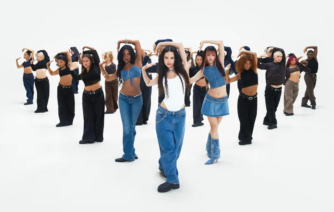 Click here for the campaign video. Image: forbes.com
Gap launched its Fall 2025 campaign in August with a 90-second video starring the global girl group KATSEYE. The six members dance in Gap denim to Kelis's 2003 hit 'Milkshake'. The choreographer Robbie Blue mixed styles like ballet, hip-hop, and jazz funk to show how denim works with movement.
The video highlights low-rise jeans and a new version of Gap's Long & Lean jeans made to fit each member's style. It celebrates self-expression through clothing, and the group's diversity and energy also matched Gap's goal to bridge generations.
It got over a million views across Gap's channels by early September. TikTok users recreated the dance, and Gap hosted a masterclass in New York for fans. The group wore head-to-toe denim looks that mixed bold fits with personal touches.
Why It Stood Out and The Takeaway
It used a familiar song to bring back low-rise denim without feeling forced. 'Milkshake' hits nostalgia for 2000s fashion, but KATSEYE made it fresh with their dance and style. The video didn't just show clothes. It showed how denim lets people move and express themselves, which made it more than an ad.
Gap knew what to do the moment they picked a rising group with real fans. KATSEYE's 20+ million followers and tour buzz helped the video spread. Gap let the group be themselves, not just as models. Fans saw that and wanted to copy the looks and dances.
For marketers and brands, you should:
- Choose music that matches your message: A known song can trigger memories and make your ad stick.
- Partner with rising talent: Groups like KATSEYE bring built-in fans and fresh energy.
- Build shareable moments: Dances and challenges turn viewers into creators.
- Let partners show their style: Always give creators room to be themselves for authentic looks.
9. Axe's 'Grab the Sweet!' Game
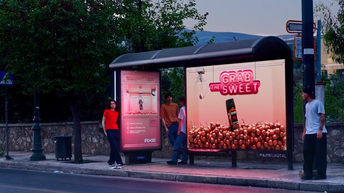 SA screenshot from the video, showing the Axe-gamified bus stop. Watch the full video here.
Axe turned a normal bus stop in Athens into a life-sized claw machine in July 2025 to launch its Cherry Fizz scent. The bus shelter looked like an arcade game, filled with big cherry visuals and the message 'Grab The Sweet!'.
People waiting for the bus (and people who weren't) could scan a QR code and play the claw game on their phone. If they "grabbed" the Axe product in the game, they instantly got tester strips from a dispenser built into the bus stop, so they could smell the fragrance right away.
Instead of handing out paper strips to random passers-by, Axe made people earn the sample through play. That changed the mood from "someone is trying to sell me something" to "this is a quick game, why not?" The campaign also became a mini attraction in the city, with reports that people visited the stop just to try it.
Why It Stood Out and The Takeaway
It stood out because it blended three things that usually sit apart: out-of-home ads, mobile interaction, and product sampling. The claw machine theme is familiar, so people understood it fast. The prize wasn't a discount code or a QR link, but the product experience itself: the smell.
It became trending since it respected how Gen Z treats ads. By turning an ad into a game, Axe got attention without shouting. And by putting it in a high-traffic spot, the brand caught people when they had time to kill anyway.
For marketers and brands, you should:
- Make waiting time useful: Put activities in places where people already have a few minutes.
- Give a real reward fast: A quick prize (like a sample) keeps people happy and willing to join in.
- Use QR codes for actions, not info: Don't link to a page; link to a simple interaction people can finish.
- Turn sampling into a story: When people "win" the product, they remember it more than a handout.
- Design for spectators too: Build something that looks fun even for people who just walk past.
10. KFC's 'All Hail Gravy' Campaign
 A screenshot from the video, which is the continuation of their 'Believe' campaign. Watch the full commercial here.
KFC UK and Ireland dropped 'All Hail Gravy' in March 2025 as part two of its 'Believe' platform. The hero film is a full-on story: a man walks through an enchanted forest, meets a group of robe-wearing 'believers', and ends up at a lake of gravy where he gets dunked and "reborn" as a piece of fried chicken.
It sounds ridiculous because it is. KFC and its agency Mother leaned into that on purpose, using big symbols, chanting, and dark humour to turn a side item (gravy) into something almost sacred. The goal wasn't to show happy people eating chicken. It was to make you stop scrolling and go, 'Wait… what did I just watch?'
The campaign didn't stop with the film. It rolled out with out-of-home ads and other activity planned to run through the year, plus a huge UK takeover where the BFI IMAX was turned into what looked like a bubbling pot of gravy.
Why It Stood Out and The Takeaway
Most fast-food ads stick to close-ups of food and a quick offer. This one built a world, like a short film, and made gravy the star of the show. Perhaps KFC designed the 'Believe' work to entertain and give people a break from boring, samey advertising, and you can see that here in every scene.
KFC was also aiming at Gen Z with absurd, cult-like humour. In a busy feed, being "fine" is basically being invisible. This campaign chose a stronger lane: be weird enough that people share it, argue about it, and remember it next time they're picking a takeaway.
For marketers and brands, you should:
- Pick a bold, creative lane: Being clearly different beats being "nice" and forgettable.
- Build a world, not a product shot: Storytelling can make even a side item feel important.
- Use big physical canvases wisely: A huge OOH takeover works best with one simple, instant visual.
- Accept that not everyone will love it: If the goal is talkability, "polarising" can still be effective.
- Keep the brand unmistakable: Even with surreal storytelling, make sure it still feels like you.
Smarter Campaigns After 2025
2025's best campaigns had one thing in common: they were easy to get and fast to share. They were also built around real human habits, like scrolling, commuting, or wanting to try a product before buying. That's what makes marketing stick.
To apply this, start with your audience's real day. Where are they? What do they do on repeat? Build one clear idea around that, then test it in one channel first before rolling it out everywhere.
Want help with your marketing campaigns and efforts? Book a free consultation and get a quick review of your campaign idea, messaging, and rollout plan.
Got a question in mind? Check out the FAQs below for quick answers!
